
|
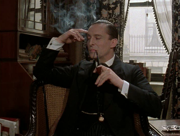
I did not appreciate Sherlock Holmes until the Benedict Cumberbatch version appeared. After growing bored of watching those episodes way too many times, I began to seek out another version of the master detective. That’s when I found Jeremy Brett’s version from the late 1980s. He was fantastic in the role and has become, for me, the Sherlock Holmes. It was not only his performance that won me over. It was the world that the series created around him - the lighting, the costumes, the Victorian-era ambiance.
I consider mise-en-scène for every single screen I develop. A screen is a shot (or a series of shots) connected to the one before it and the one after it. Every course is a visual story – like a movie. Okay, okay. I admit that these may be the ramblings of a kid who dreamed of being a filmmaker when she grew up and who is now just pretending to be one. Regardless, I approach each slide believing that while the subject is the character, the environment tells the story.
I typically build scenario-based courses on a set, which is my way of saying that I will build out an environment in an attempt to make the experience as immersive as possible. If I can find the perfect back drop, I am more than happy to put the character in front of that picture and go on with my life. But that RARELY happens. The images I find are either at a weird angle or there is only one version of the image (I need to move my characters to different rooms in the same space). Also, I want my characters to be in the scene, behind a desk or sitting in a chair, not just floating on top of it. Consequently, I end up making many sets myself. Here’s what I consider when I’m building a mise-en-scène .
The goal is to create visual depth. Every trick I use is in service of that goal. I use five strategies to create depth and typically consider them in this order: 1) layering, 2) objects, 3) perspective, 4) blurring, and 5) shadowing. We’ll use a screen I just built for a course as a reference.
This scene takes place in a recreational center. Myra is the founder and operator. She is not the avatar, but she plays a key role in the course. The only tool I used to create this scene was PowerPoint.
Layering Every scene is a series of layers (not Storyline layers) piled up on top of one another. Our example above has two primary layers, the back wall and the desk. Everything else you see are objects manipulated to add to the appearance of separation between those two layers. The windows add more depth to the wall layer, but they also contribute to the mise-en-scène . What shows through the window is vital because it gives you a sense of place and time. Myra's center is on a city street with both businesses and apartment buildings as you can see by peeping through the windows. Objects The objects signify what the character considers as either meaningful or useful. I chose to adorn the back wall with pictures and signs because blurring them adds some distance to the wall layer. They also have a storytelling function. Myra is a caring person who has dedicated her life to building a safe space where adults can learn. She often has to encourage students to stay focused on their studies for the sake of their families, if not for themselves. Her own family and their accomplishments motivate her as well. None of that information is in the course. I gave her that back story and built a space that reflects my choices. I chose every picture on the wall on purpose and gave each person a role in her life. Perspective I didn’t think about perspective as a thing until a fellow ID questioned the size of a set of index cards that I made in relation to everything else on the screen. Now, I focus a lot on perspective. I compared the size of the stapler to the mug and how tall Myra sits in the chair in relation to the top of the computer. Blurring I’ve seen courses that are supposed to be layered that do not use blurring. I’ve also debated the use of blurring . Something feels clichéabout the practice. I blur objects not for the themselves itself, but to sharpen the focus of the items around them. It’s also important to decrease the blurs’ radius on layers that are closer to the front. Shadowing I also use shadowing to add depth to my objects. Shadowing is a way to manipulate lighting, which is an essential element in creating texture and distance. Shadowing can be abused so use it for a meaningful reason instead of simple decoration. Yes, it does create that interesting "pop," but there are other more suitable ways to grab the learner's attention. For example, I never shadow text because bolding, italics, size, or color are more effective strategiesfor influencing the viewer. Shadowing only makes text difficult to read. I do not think the learner notices all of these details. That’s not the point. I believe clients do take this all in as a whole, just as they would in real life. I want them to feel the same way they do when they walk up to a desk and see a gallery of several generations of a family on the back wall. If they think that's adorable in real life, I want them to think it now. If they think it’s stupid in real life, I want them to think that now too. I want Myra to be real to them. I want them to trust her and empathize with her. Everything contained within the mise-en-scène contributes to that, whether I intended it to or not.
0 Comments
Your comment will be posted after it is approved.
Leave a Reply. |
�
AuthorHadiya Nuriddin is the CEO of Focus Learning Solutions and the founder of Fresh Eye Reviews. Categories
All
Stay up to date!
Enter your email to get a monthly digest of blog posts and other Focus Learning Solutions insights and news (we will not sell your email address). Archives
September 2016

|
 RSS Feed